Navigation improvements for mobile users

Status
Not open for further replies.

Holo

Admin
Joined
May 29, 2012
Messages
1,434
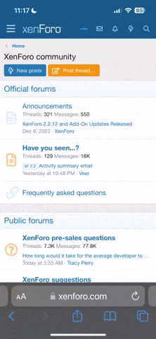
Even in the midst of all these DDoS attacks, we have completed some improvements for mobile users.

Instead of the hamburger giving you a dropdown containing the navigation links, which is the default bootstrap behaviour, instead it will reveal a left menu with the navigation links. This menu can be closed by swiping left in the menu, or by tapping on the grey area to the right of the menu. You can also reveal the navigation menu by swiping right from the left edge.

Swiping left from the right edge will reveal a menu on the right. So far, I haven't decided what should go there yet, so enjoy best girl for now.
 
I feel like a bit of an arse by complaining about this, but having the navigation be a swipe-in from the left-hand side makes it impossible for me to access navigation one-handed when holding my phone in my right hand.
 
I had it on the right, but apparently it is convention to have the menu on the left. I will improve it by allowing users to switch sides in the user settings tomorrow.
 
Swiping from the right or left is browser forward/back, so they’ll never open any menu.
 
I think, the color isn't changed at dark-slate theme.

But, now i can change theme and other settings without getting back to profile settings.
 
@Guspaz I guess swipe will only work if they aren't already assigned to other functions. That's why you can also tap the icons to open.
 
I like the new look for mobile since I use chrome on my phone but I am starting to hate the capthca keeps popping up to much when I'm reading. it's like every 30 min or so
 
@Holo: To clarify, that's the default for swiping from edges in Chrome and Safari on iOS. Probably other browsers too.
 
Dark-Bronze and Dark-Slate has the left menu with a white background. Other than that, the update looks great! Thanks for you guys’ work.
 
Now you can't easily access the forum while holding the phone horizontally
Da3iZr1.png
you can't scroll there
 
Thanks for improving the mobile experience.

Can I make a suggestion though? In my opinion, I think any item in a menu list (sidebar, pop-out) should be bigger so that tapping/clicking into an item using a finger is much easier. What I mean is there should be more white space around an item in a list maybe through adding some more padding. Same rule should apply to pop-out menu as well (e.g the Manga, Community, Info).

Because I'm not very familiar with Bootstrap (yet, I'm an android app developer), I don't know how easy or how hard to implement this but just something that I think should be taken into consideration.
 
As much as I appreciate the changes, I'm used to opening the menu on the top right so this is gonna take some getting used to with swap. Also having the option to switch the settings button and menu would be nice.
 
The setting to switch sides can't come soon enough.

Also, you mentioned best girl but I don't see Nino anywhere, just Miku for some reason.
 
When using long strip mode on mobile, and I'm at the end of the chapter and tap to go to the next one, the browser directly scrolls down to the end of the new chapter instead of staying at the beginning. Has this been already been reported / fixed?
 
Status
Not open for further replies.

Users who are viewing this thread

Back
Top